Code
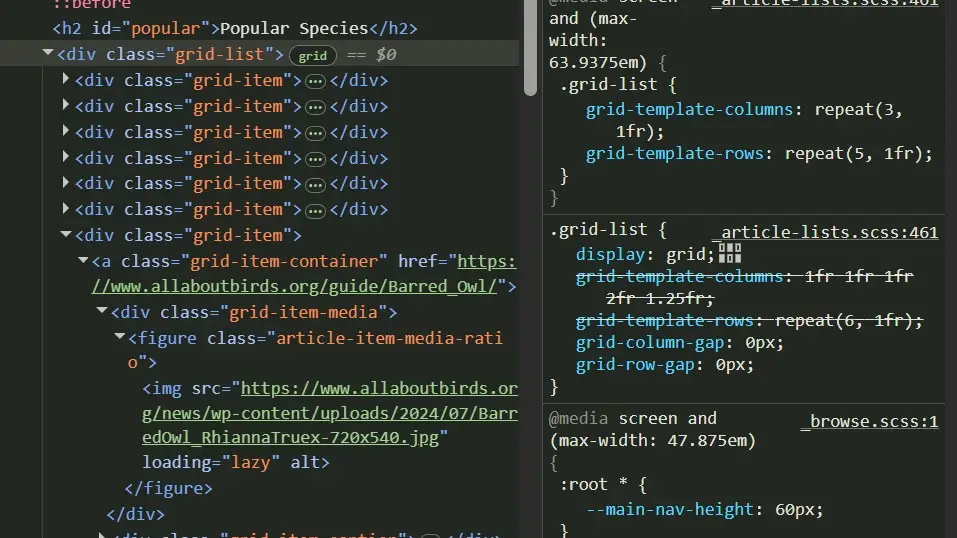
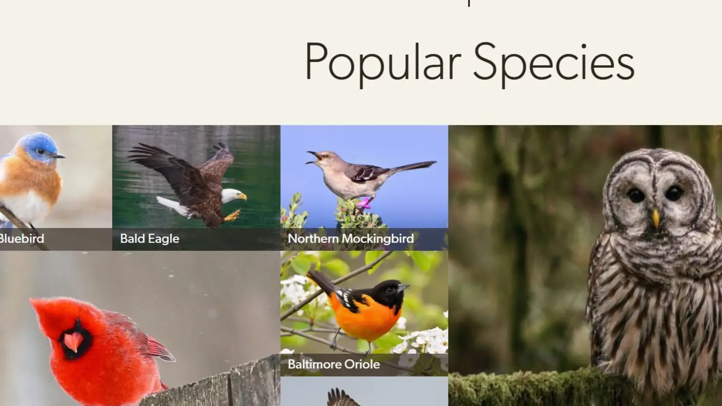
I wanted to look deeper into the code they used for all of their different bird images on the various pages, including the different navigational menus they had. The specific one I was viewing was their showcase of images regarding popular species of birds. Most of the time, this website utilizes the grid CSS property, and it was fun manipulating the different numbers for the rows, columns, and gaps to see how each of the pictures moved around. I also looked at how things changed with the grids based on small screen versus large screen. The number of grids and columns, and how they were utilized changed.
UI
The use of colors on the All About Birds website are great choices in my opinion. The use of more basic, duller colors like white, light blue, and tan help to give the images of the birds the spotlight since most of the images used showcase the birds coloring and activity. Since showcasing and teaching about birds is the primary use of the website, this makes sense! When I was planning out the color scheme for this website review, I decided to instead choose a bird to bring in some color other than white and black!
UX
I love all of the information provided on the website; however, it is quite busy. There is a lot of information on every page, and it is a lot to navigate. While the developers provide a variety of drop down menus and care previews for each section, it still felt like a lot to me. When I shared with my partner, Garret, that I was choosing this website for my review, he even shared how he easily gets lost on the website. Additionally, what also does not help with the busy feeling of the website is when opening a new page on the website sometimes an ad pops up and asks for a donation. While I understand donations are integral to the continuation of the website and research behind all of the great information provided on the website, I found it very annoying, and I would be more interested in a prominent ad on the webpage itself as I’m using it because it is at that point I realize how beneficial the information on the website is for users interested in birds. When the ad pops up first thing when arriving at the website, I don’t even know the value of the website initially and would not jump at donating money right away, if at all. Lastly, when I ended up in their academy where they offer their classes, there was not a clear way to return back to the main All About Birds home page. Again, aids the “lost” feeling.
Summary
I love the information on this web page and reference it often, so I am motivated to look past the business of the web page and spend time getting to know it. The bird pictures also pull me in, and I can image many other users. However, if I was not as interested in birding as I am, I can see where a user my end up feeling lost on their web page and move on or miss some really great information provided because it was lost within the website. Including a more basic summary on the home page with some of their best pictures of the week or day would be more beneficial to the quick browser. Once on the bird information pages themselves, they do offer a quick menu and buttons that you can find easily for bird sounds and ID information. The developers know this is the main reason users use this website, so they are at least wise to include the search for species first on the home page! Lastly, I appreciated exploring how they use images on their website since one of the reasons I am pursuing an education in web development is for is for my husband and I’s business and we need to use a lot of photos to showcase his artistic work on our website!