Code
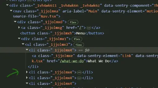
When looking at the code of the website, I found the class names provided very confusing. So far we have been taught to follow a naming convention that helps describe what content or code that name is impacting, which helps anyone reviewing the code be able to make sense of what is happening where. Their names are, to me, just a bunch of letters and numbers, and do not hold meaning. As a developer-in-training attempting to interpret their code, it makes it much more difficult. This company seems on the smaller side, given the “About Us” page, so there may not be significant turn-over where new developers will need to engage with already written code often, but I still appreciate being trained to use class and ID names that hold meaning and can point to what they are impacting.
UI
While exploring the website, I found that the developers used movement in a couple different ways. One way that I found very helpful is when they showcased case studies they performed, and when hovering over the picture of the case study on the web page, the original folded back and revealed a moving image underneath it. I thought this was a creative way to alert the user there is “more underneath” or clickable for more information. It seems the developers utilize the “::before” and “::after” pseudo-elements to do so. I also appreciated how they provided a more accessible option for those who may not see the image, with a link in the text below the image. I also thought it was great that some images would be dulled and then become more vivid as the user scanned down to view that section of the web page. It helps keep the focus on the current image and content.
Some parts of the web pages that moved were very distracting to me and took my eyes away from the content on the page. A couple examples are the rotating image on the home page, the moving eyeball on “what-we-do” page, and the lines that form sometimes while scrolling down on a page. It was what was first noticed each time, and it does not seem like those pieces are what the developers would want as the most immediate or continued focus.

UX
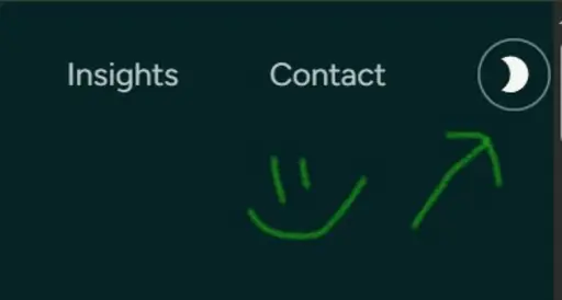
One of the UX components I appreciated was the ability to go into dark mode with the website. I noticed that when I went to the website on my computer versus watching it in the lecture, it automatically went into dark mode, which may be because my Google Chrome is set to be in dark mode. My eyes a very sensitive to color and light due to a major head injury in 2014, and bright colors, especially on a monitor, hurt my eyes and can trigger migraines. I sigh a great sigh of relief when I can be in dark mode while working on a computer or mobile device. The tension in my body releases, which leads to me having a much better experience with the website or program. Since the majority of this website is white when in light mode, being able to be in dark mode made it much less painful to navigate and I was able to explore the website in longer periods of time. It also resulted in the spinning logo being less distracting than when the home page was viewed in light mode.
It was interesting to see how being able to switch from light mode to dark mode was coded as any website I create, as to the extent I have control over design, I would plan to include this feature. I was able to continue my investigation on the CSS property: color-scheme. I also noticed that when switching from light mode to dark mode, a few of their class names changed within the code. While I did not have time to dive deeper into this now to understand it, I look forward to learning more once I do have the time!
Summary
Overall, the website is easy to navigate, flexible with light and dark mode, and uses a consistent color scheme and patterns (use of the swirly lines). It also has interesting ways to use movement and color to focus the user’s attention in a certain area. The tone of writing is very down-to-earth, which helps the user relate and connect with the writers (and company), and choice in content on their website highlights their values, which could draw the clientele best suited for their type of work. I appreciated being able to see how another website is using the different elements and styles we have been learning both in the first design course, and this one so far!